The Bizu brand design project was developed from Agência Shifty. The name "bizu" in Portuguese is a colloquial term that means an ease to achieve or do a goal. In this sense, the company Bizu aimed to create a digital network of facilitated loans and credits for low-income customers.
The company's initial target audience would be young adults and adults who need a line of credit to solve small daily problems such as student payments, medical expenses or expenses associated with children and/or dependents (school fees, treatments, extracurricular activities, etc).
With the briefing being developed by the Creative Directors, I decided to focus our efforts on choosing a youthful, engaging color palette in warm tones that would be in harmony with a more "POP" positioning as per requested by the client.
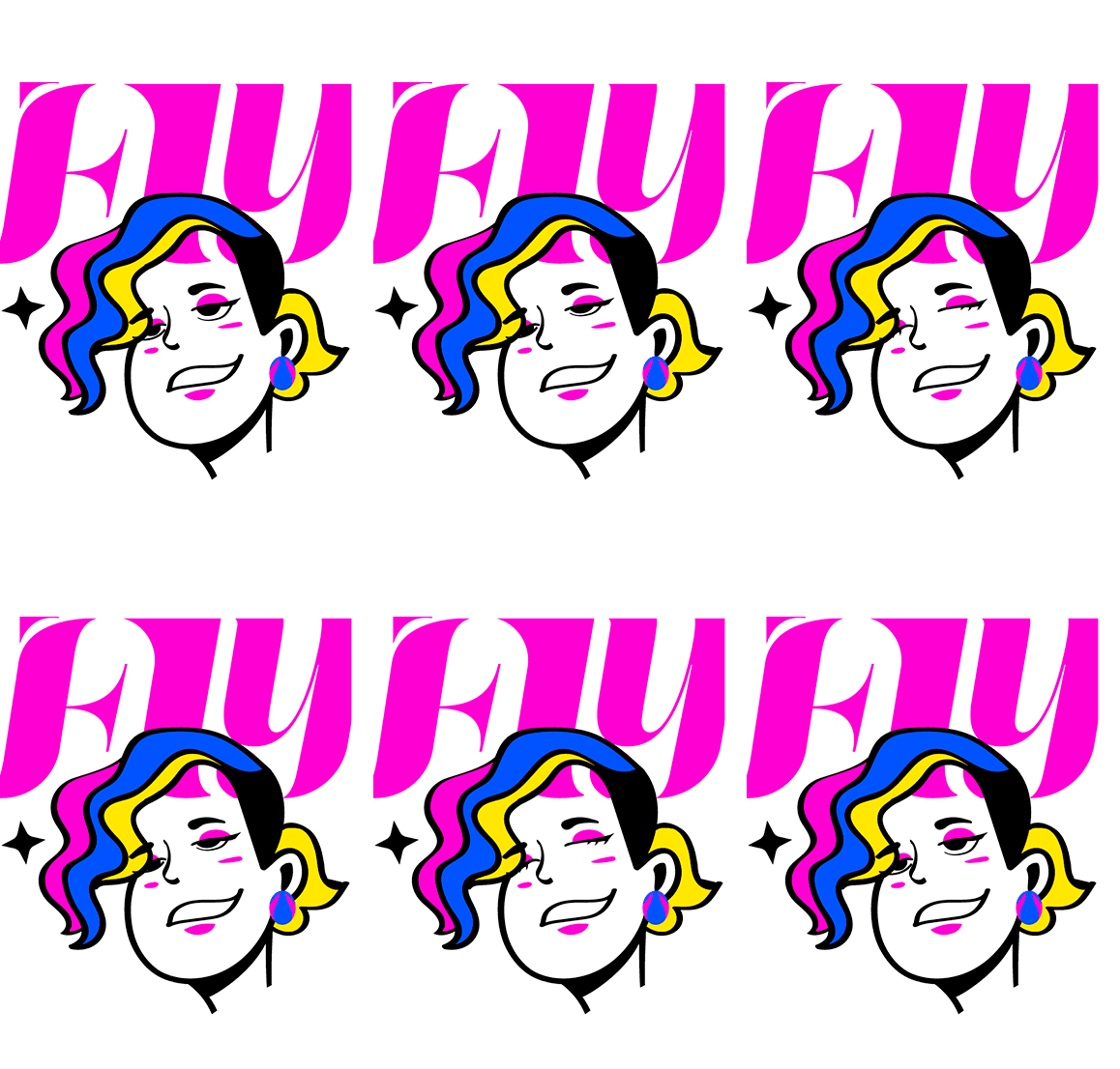
With the briefing in hand, I dedicated myself to producing the drafts of the logo and illustrations to be used in the campaign to publicize the brand's services. The final result can be seen below.
Com essa ideia gerada pela comunicação, a paleta de cores precisava estar em harmonia e que trouxesse esse posicionamento mais "POP". Em conclusão foi criada uma paleta de cores vibrantes de tom quente de tipo análoga, com um fundo forte e sóbrio para dar a leitura necessária.
Mockups and Brand Identity
Campaign and Illustrations
Storyboard concept for one-minute animation for the company's presentation (screen development for final animation).
Team members:
Design and layout: Fly Lima
Creative Directors: Raphael Piteiro and Bernardo Barbosa
